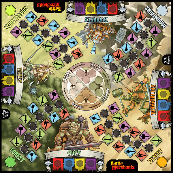
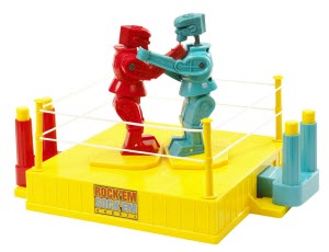
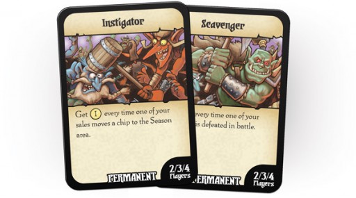
Before Battle Merchants joined the Minion Games library, before the pair of Kickstarters were run to fund it, and even before players were exchanging sharp axes and hefty hammers with anyone willing to pay, Battle Merchants once looked very different. As is often the case when making a game, your final product may not always look the same as when you first set out with your grand idea. Designer Gil Hova has offered up an account of how his simple game about robots morphed into the arms-dealing product we know today.
Yes, we said robots.
Enjoy!
Beginning Stages
I once had a strategy auction game called Wag the Wolf. It wasn’t a bad game; it made it onto Hippodice’s “Recommended” list in 2006. But it never really seemed to fulfill its promise. It had a bunch of great mechanisms, but I could never gel them into a great game.
One of its mechanisms that I wanted to salvage was a really cool auction. In it, each player had the option to outbid the previous player, or underbid the current high bid. There were always two fewer underbid slots than the number of players, so one player did not have the option to underbid; he had to outbid or fold. This forced all players to constantly seek shelter in an underbid, or go for a big expenditure and outbid.
I was also curious about designing a game with a military-industrial complex theme. I didn’t want to get preachy about it (though I’m of the opinion that it’s a subject in which there’s plenty to get preachy about); I just thought there was something deliciously amoral about profiting from a constant state of war, and I figured it would make for a distinctive theme.
The first version of the game was called War Machine, partly because it was set in the future with fighting robots, and partly because at the time, I hadn’t heard of the miniatures game with the same name. It was a game where players spent one phase of a round bidding for turn order, another round getting special bonus cards, another phase acquiring Tech, another phase building the robots, and another phase selling them. The countries players sold to were called, colorfully enough, “North”, “South”, “East”, and “West”.
After the first playtest, there was an immediate thematic issue. The winner was the player with the most VP. But the players were arms merchants…why should arms merchants care about victory points? So one of the first tenets of the game was established: the richest player wins.
These games are tricky to design because they’re naturally snowballing games. Or, to put it another way, every coin is a victory point, but you must spend victory points to earn more victory points. Working out that balance was one of the things that took a long time.
Here are some other significant changes I made between then and now.
The Science-fiction Theme
I’ve learned a lot about game theming from this game. There’s a lot of folks who think that all you need to do with a set of mechanisms is slap on a sexy theme, and that will make it immediately more appealing. Or if a theme doesn’t seem too closely connected to a game, you can just replace it with another theme, and that will just work better, right?
Not really. I loved the theme for the game – who doesn’t love fighting robots? But I noticed a dissonance happening. I’d ask players, “Hey, do you want to play my game about building and selling fighting robots?” And they’d answer, “Sure, I’ll play your game about fighting robots.”
Notice the difference?
People would sit down expecting lasers and grenades, and they’d get profits and margins. They’d adjust by a few rounds in, but I didn’t want them to adjust at all.
A game’s theme is a peek into the game’s mechanisms. A swashbuckling pirate game should not have low player interaction. A stock market game should not be a 2-player abstract with perfect information. A game about zombies should not feel dry and emotionless. A game with a fascinating, innovative Euro-style mechanism should not have a crazy, off-the-wall theme with cartoon art. The games might wind up being good solid fun in the end, but they have to overcome a theme/mechanism mismatch and the player confusion that results from it.
Next I tried a city-building theme (explaining “defeated” tiles by saying they were buildings that got destroyed), but that was one of the most miserably dry playtests I’ve ever had, and it reinforced my goal to never design a game about building a city, or about shipping in the Mediterranean, or about building a castle, or especially about bloodlessly colonizing a new land. And I’m not even going to mention Cthulhu.
Once I switched to the fantasy theme, everything clicked into place. Fantasy games have long had a capitalist bent; after all, in your average canonical fantasy RPG, players start campaigns by buying cheap weapons and armor, then upgrading to nicer weapons during their adventures, and then selling off all their old, underpowered weapons and potions they don’t need. Since there was a strong mercantile precedent in the genre already, no one got confused by the game’s theme.
And as my experiment with the city-building theme showed, the unique theme is important. Maybe it seems like you could slide another theme on top, but I assure you, it wouldn’t be as much fun. And yet the theme is not too outrageous; it’s grounded enough to mesh nicely with its mechanisms.
Limited Fighting
At one point, the chips all had their territory names printed on them. Between seasons, players would put all the chips from the middle of the board into a bag, and then draw a few chips. The later in the game, the more chips they’d draw. The territory on their chip would indicate what region would fight. There was a different (and quite fiddly) resolution mechanism that indicated which piece would be destroyed.
People kept telling me they wanted to see more fighting. So, I kept increasing the number of tiles to draw from the bag. The fighting got cooler, and I thought I was making the right decision.
Someone – I believe it was fellow designer Seth Jaffee [Eminent Domain] – suggested that I get rid of the bag-pull mechanism altogether and just have everything fight. But I resisted this suggestion for so long. I loved my little mechanism, and I didn’t want to let go of it.
But of course, once I got rid of the bag-pull mechanism, everything worked a million times better. The bag-pull was acting as a veil over the fights, but that was a needless opacity. Why should that info be obscured? Let players know that everything fights, and the game became a million times more clear.
Phase Structure
Originally, Battle Merchants used to be a strict seven rounds, split into fixed phases. There was the auction phase, then the Government Card phase (Government Cards eventually becoming Kingdom Cards), then the Tech phase (Tech Cards becoming Craft Cards), then the Build phase, then the Sell phase.
When I ditched the auction, I decided to ditch the phase structure as well. Players would instead have to choose between each of these actions every turn. This early choice worked beautifully, adding another layer of tactics to the game, as players had to weigh which option was the best option for them to do that turn, rather than be assured they could do everything during the appropriate phase.
Rewarding Tiles
The rewards for this game used to be a complete mess.
I always wanted the rewards to be thematic, so even after I made the switch to the fantasy theme and Countries became Races, I still had my original reward system. It worked like this: there were no Reward Tiles. Instead, every time a race lost a battle, you moved up its marker on a track. The more a race lost, the more they would pay for a weapon. At the end of the game, players got a bonus for having the most surviving weapons with the race that lost the least (e.g. the winning race).
There were a ton of problems with this mechanism. First, it was very fiddly. It was easy to miss bumping up each race’s loss on the track, and there was no way to really audit that information afterwards.
Second, it was opaque. Players couldn’t see through it to work out how to game the system to their benefit. No one really cared about the implications of the track and which race gave them the most money until right before sales happened. There was no way to easily grok how a sale would ultimately impact the reward system.
Third, it was too spread-out. Players calculated their revenue by adding three things in three different parts of the board: the base sale price on their player mats, the track in the middle of the board, and any Localized Need Kingdom Cards they picked up during the game. It was annoying to make these calculations and easy to miss a number.
I wanted to simplify this system. But how? I couldn’t just give a player a reward for selling to a given race. That wasn’t thematic, and worse, it would lead to a boring snowball effect. If you got a bonus for selling to the Orcs, you’d just want to sell to the Orcs again, which would get you another bonus for the Orcs, so you’d be even more predisposed to sell to the Orcs, and so on.(At the time, there was no limit per season to the number of rewards you got per season per race, although it seems so obvious in hindsight.)
I scrapped the tracks and replaced them with something close to what exists in Battle Merchants now. That is, when you sold to a race, you picked up a tile for the race they were fighting. And you could keep on picking up tiles for the same race, as long as you set up the battles properly.
This was thematic, because every time you sold to a race, the other side would pay you more money to sell to them as well. It also encouraged players to spread out all over the board. The only problem was that it was still extremely fiddly. It was tough to remember that you took a tile for the race you didn’t sell to. It wasn’t all that intuitive, and players hated it.
I was in despair when a playtester suggested something simple: why not reward players for selling to a race by giving them a tile for that race, and limit that reward to one tile per race per season?
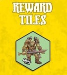 How flabbergasting! This solved all the problems. It was easy to implement, easy to audit, easy to see how your decision would impact the game, and it would not result in players just getting one reward for one race in one season. Sure, players could end the game with a bunch of rewards for the same race, but they’d have to work for it with interesting decisions.
So there it was: the reward issue resolved. It wasn’t terribly thematic (a race giving you more money when you kept selling to them?), but for some reason, it was a million times more intuitive than my more thematic approaches.
Leveled Weapons And The Dreaded Die
There are two levels of weapons in the final game: Standard and Vorpal. Originally, there were five.
I numbered them 1 through 5. Every time you got a level of Craft, you could forge the next-higher weapon. Therefore, your Level 3 weapon would beat an opponent’s Level 2 weapon, right?
Not exactly. Would you believe I used to have dice in this game?
That’s right – every time you fought a battle, each player would roll a die, and add the value to her weapon value. I thought it was interesting for a Level 5 weapon to possibly lose to a Level 1 weapon. And, of course, there were Craft Cards and Kingdom Cards that would mess with your die roll.
The first things to go were the Level 2 and Level 4 weapons. People just didn’t forge them. They weren’t interesting. If you couldn’t make a Level 5, why bother?
So that left me with Levels 1, 3, and 5. And the die…which thankfully vanished soon afterwards. It was another case of needless opacity. Why veil the battle outcome? It was wasier to just to see who has the higher number.
Then someone pointed out that Level 3 weapons weren’t all that great. Sure they could beat Level 1 weapons, but so what? Why not just go straight up to Level 5?
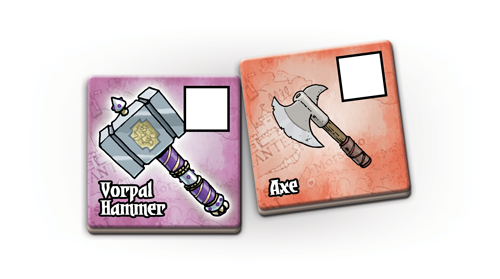 You’ve seen what happened next. I took out the Level 3 weapons, and then it became clear that those numbered levels just weren’t needed anymore. Level 1 weapons became Standards, and Level 5 became Vorpals. And Battle Merchants became that much more intuitive.
Master Craftsman bonuses
There are four available Master Craftsman cards, and four possible actions. At first, I wanted to take advantage of this symmetry. Initially, each Master Craftsman gave you an extra action in one of the listed actions. One weapon type let you take multiple Kingdom cards. Another let you take multiple Craft cards. Another let you sell twice in a turn. And the last one let you forge and sell in the same turn.
One of the best playtests of the game came when Michael Keller [City Hall, Captains of Industry] pointed out to me that one of those cards was horribly overpowered. I couldn’t even guess which card it was, and I was shocked when he claimed it was the forge-and-sell card.
I didn’t believe it, I said. Prove it.
And he did. We played, he took that card, and he doubled my score.
I thought on how I could nerf that card, but eventually, I decided that balancing these four actions was not really going to be worth the time. Instead, I gave all four of them the same power, and just tied them to the appropriate weapon.
And There You Have It!
Battle Merchants was a big step for me as a game designer. I started with a lot of gimmicky, wacky mechanisms that sounded nifty, but that didn’t really help the game. But relentless playtesting helped me push those out, in favor of mechanisms that actually flattered each other and the theme. With a lot of help from my playtesters, I ended up with a game I’m extremely proud of.
![]()
Battle Merchants creator Gil Hova was gracious enough to supply this designer journal. He can be found most readily via Twitter.
Discuss this, and other articles, on our social media!
Photo Credits: Battle Merchant Images by Minion Games; Cthulhu by Toy Vault; Futurama Image by Comedy Central; Hoarders by A&E; Vorpal Sword by Alice in Wonderland Wikia;

