While a game about crafting, creating, building, or otherwise forging items in and of itself isn’t exactly new, Swordcrafters goes the extra step in that thematic immersion. Rather than abstract the idea of creating glorious weaponry, the crux of the game – indeed its entire conceit – revolves around the act of creating three-dimentional swords.
To learn more about the origins and genesis of such a game concept, we turned to one of the co-designers themselves, who walks us through just how we got the game you see before you.
Editor’s Note: This article was originally posted on Adam’s Apple Games’ website over the span of its early 2018 Kickstarter campaign. It has been compiled together and reposted with minor edits.
Every game needs a hook.
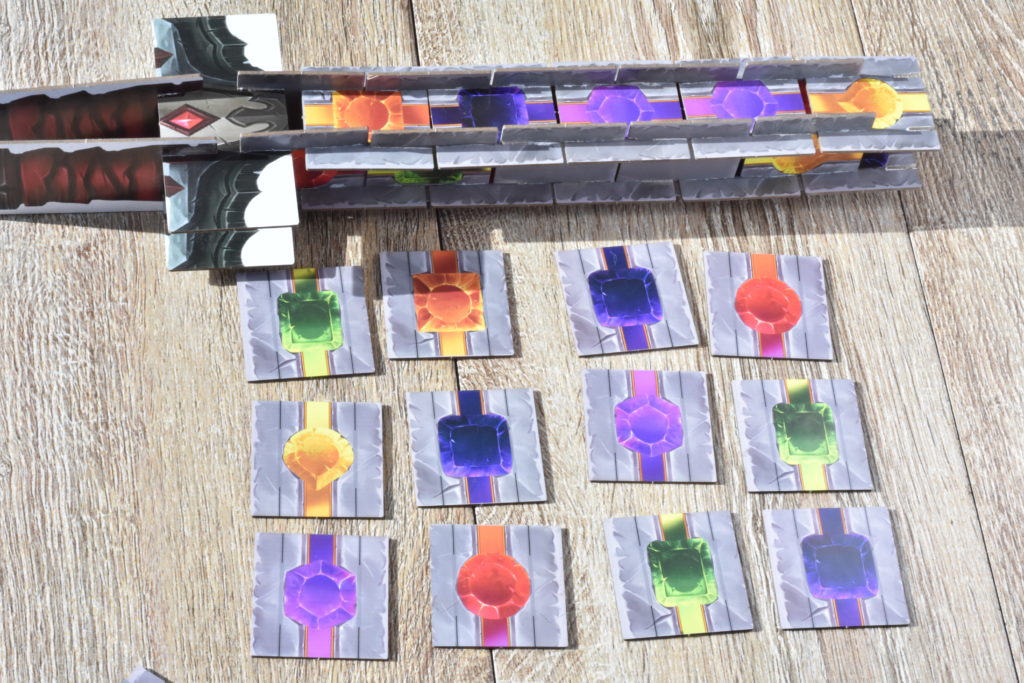
In Swordcrafters, you split and choose groups of slotted sword tiles, and then assemble them into the 3D structure of a sword. This is a game that combines the play patterns of modern board games with the building play patterns found in toys such as KNEX or Legos.
Making a game out of assembling a sword provided Swordcrafters with a seriously cool hook. Swords are cool. Holding a sword is cooler. Holding a cardboard sword is both ironic and nostalgic, and it feels unbelievably satisfying to people of all ages. People not involved will ask you what you are doing or what you are playing, and eyes will be drawn to the table with five people holding swords. There may also be many sword jokes told, although I will resist the temptation here.
Not only is this concept fresh and wonderfully playful, but Swordcrafters is also really simple and easy to pick up!
The Mechanics
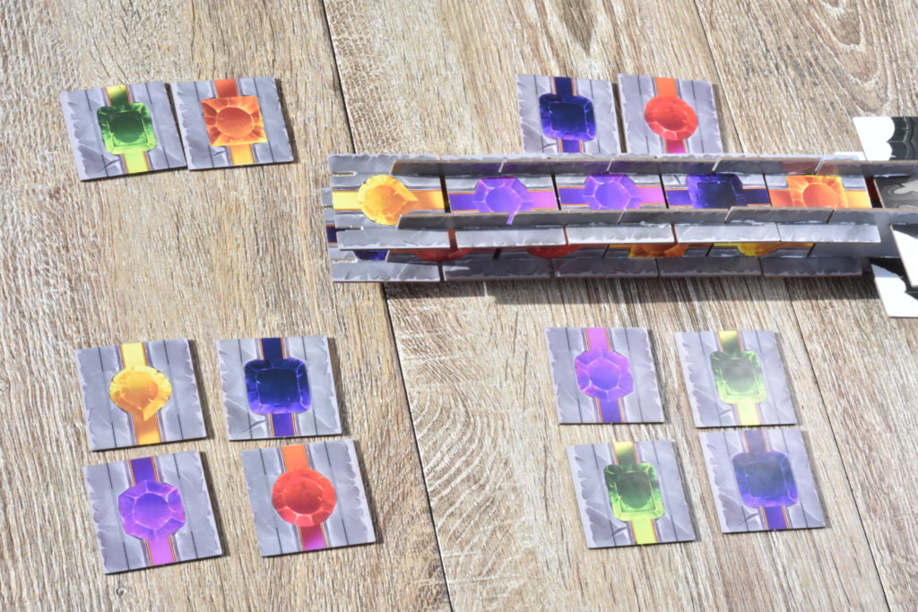
The mechanics are very simple and run parallel to the “I split, You Choose” style of games. A grid of sword tiles is laid out each round. Each sword tile is either blank or has a colored gem in it. The first player makes one completely vertical or completely horizontal separation, separating one group into two. Think about this act loosely like a sword slicing it apart, as it does not contain any right angles. This provides a thematic mechanic…check. Now for the newness factor. In Swordcrafters, each player makes one separation in the grid. Then when the turn comes back to the first player, you select one group of available tiles and players “craft” the sword tiles into their sword by lining up the slotted tiles.
First player is deemed significant here. That’s why we also put a first player tile inside the grid of every round that you can choose as part of your spoils. Selecting the grouping with the first player tile lowers the value of your selections this round but gives you a large benefit to turn order in the next.
Why you care about which sword tile grouping you get is where the scoring and the goal of the game comes in. We’re not just building a sword as our goal. We’re also comparing it to other players based on its length, quality, and magic potency.
- The longest sword gets a bonus (10VP).
- Quality is determined by evaluating each of the four sides of your sword. The largest set of adjacent gems on one side of your sword dictates your quality score.
- Magic is determined by a randomized assortment of three Sword Magic cards at the start of the game. Each card looks for a combination of two gem types, and the total of this combination is the magic value of your sword. You evaluate sword magic scoring three total times, one for each card.
And that’s it. Rounds are played until you run out of tiles. For a 2-3 players game that works out to 8 rounds. For a 4-5 player game, it’s 6 rounds.
The Theme and Visuals
The theme is sharply honed, but fantasy games are not something AAG [Adam’s Apple Games] has done in the past. For this reason, finding the right graphical voice was a big challenge. Also, a sword is really cool, but how do you make a 3-D interpretation of a sword come to life while still being a game?
My guiding light for visual design became trying to create artwork that actually resembled a sword. But not like a real sword – a cool fantasy sword. Using too much “metal” would surely fall flat. This is where the gems come in. Gems are not traditionally found in all swords, but the gaming industry has adopted the common fantasy genre trope of incorporating gems/runes /“materias” into making fantasy weapons. So let’s use this to our advantage and bring color into play.
My vision for the audience of this game is a wide appeal, so I went with a fantasy artwork style that has vibrant colors and accessibility. When I was searching for an artist, I looked for talented artists that were making a splash in the Blizzard Fan Art scene, since this art style is typically vibrant and fantastic.
Of course, the game didn’t start out quite the way it appears now…
A Game called Dungeon Greed
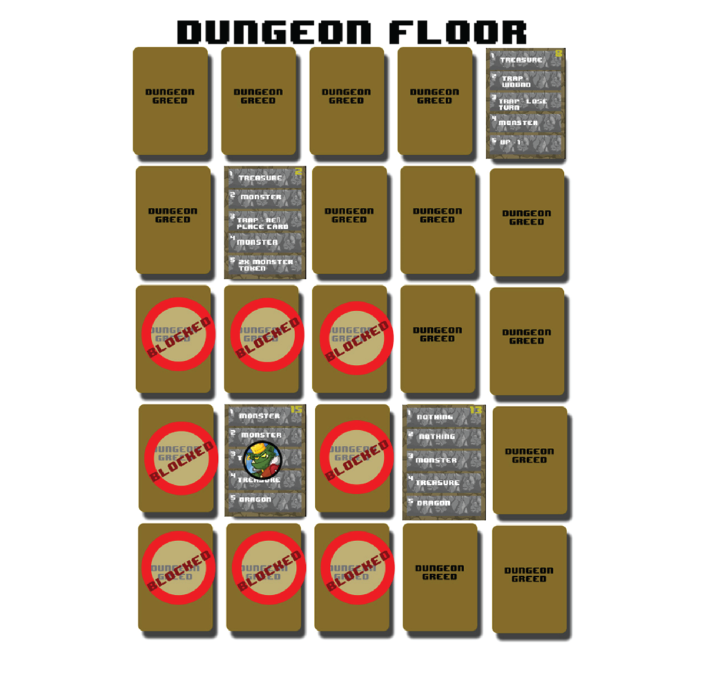
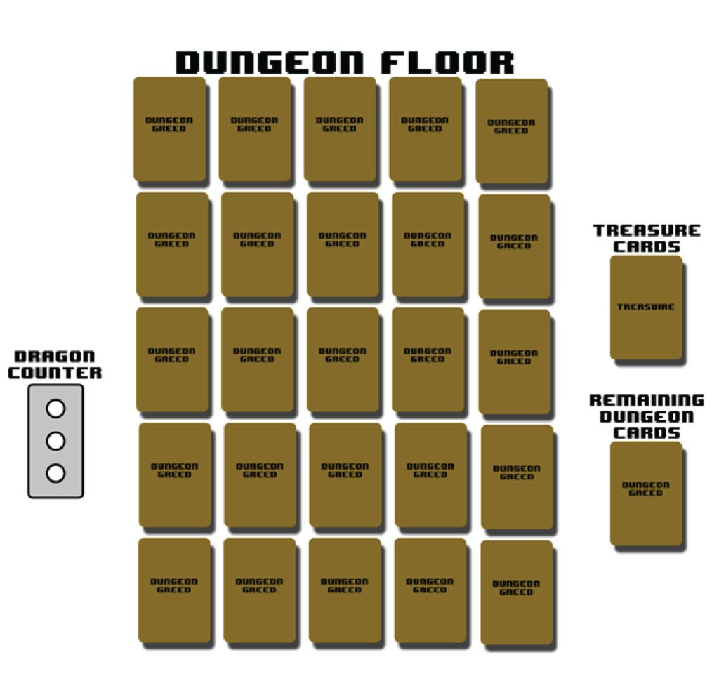
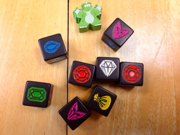
Swordcrafters started out as a game called Dungeon Greed, created by my good friend Chris Neuman. He prototyped and playtested a grid of cards exploring a dungeon. There was dice rolling and push your luck, and the game had promise. Chris created at least eight or nine versions of the prototype and played it often. However, it was was eventually tucked away with a forgotten passion after a rough Protospiel experience. It happens. You need to have the gumption to get a design published in this industry. We continued to chat about the game from time to time though.
One day, Chris and I took a crack at revitalizing the game by adding a resource mechanic, reducing setup time, and tweaking the press your luck decisions. As you explore the dungeon, you now had the challenge to collect resources and purchase a sword. You could upgrade your sword via Splendor-style purchases. There would be multiple tiers of swords available to each player. You would start with a common and dull blade and end with a badass blade. Each blade would include a different set of abilities or dice to be used to fight monsters in the dungeon. We made the dungeon ever-expanding so players did not have to suffer through multiple setups, and refocused the push your luck mechanics into the sword and how the sword is used. This is where the name Swordcrafters originated.
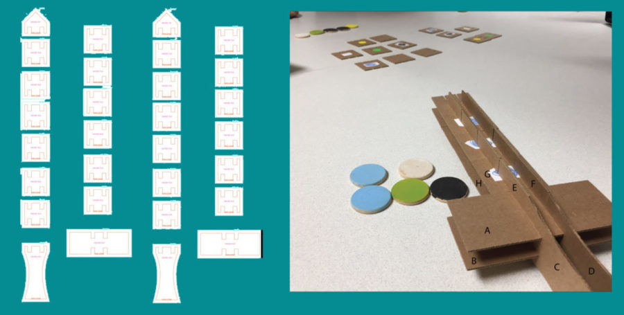
When I type it all out, that game also sounds compelling to me. But it was a twist on a different vision. I wasn’t particularly passionate about playtesting and didn’t pursue it. (Gumption!) We had about 2-3 iterations built into it at that point by designing the mechanics, playtesting on Tabletop Simulator, creating the placeholder artwork, and prototyping through The Game Crafter. Inevitably, this sadly became was a classic mistake of too much asset creation and not enough playtesting.
The Final Vision
Which brings me to the current and final design of Swordcrafters. We were sitting in our booth at Gen Con 2017 during the closing minutes after a very successful show. Chris and I started reminiscing about Dungeon Greed and Swordcrafters, happily exhausted from the weekend. Then it clicked: what if we were actually building a sword…and holding it as we play? That was our eureka moment. And Swordcrafters was reborn. The cutting mechanics came together quickly once the new vision was alive. I was able to hack together a rough prototype within two weeks of returning to Minneapolis, and have only improved it since. I often find that creativity comes in surges, and this was one very special surge of it.
Hammering It All Out
The first time we played Swordcrafters, it was already a magical experience and I knew I had something special. But it also had problems. For starters, the score was completely lopsided and scoring took way too long. There was originally a third phase beyond slicing and selecting that helped people see the motivations of their opponents, but the thematic explanation for this phase was weak, and others at the table weren’t convinced about its efficacy. There was a also problem that a weak player sitting next to a strong player greatly benefited the strong player. I had a game that definitely found the fun instantly, but was cluttered with too many ideas.
Where to begin?
When a first playtest feels magical, it makes it psychologically difficult to make changes at risk of losing the fun. But it’s a necessary part of the process. And so change we did.
Change Number 1: Issues with Scoring (Attempt #1)
The simplest thing to try to fix was the scoring. A lopsided score is never all that fun. Players that score well should deserve it, and there should not be a dominant strategy. So we played around with how the scoring works.
Aaaaaand that was absolutely a trap, but it was so tempting to fall into. Changing scoring did not significantly improve the game. There were bigger problems. The thought became that perhaps if I fix those other areas, the scoring fix will come more naturally.
Change Number 2: Issues #1 with Splitting
Early on, a strong player definitely benefited by sitting next to a weak player. That was a problem! The issue was that the player who started selecting a group of sword tiles was variable. This variability was not a predictable outcome, but rather was at the mercy of the players’ decisions at the table. If a player didn’t understand the implications of that system, then they might king-make the entire game.
With that in mind, what if everybody only gets to make one separation? That means the first player to select tiles is predictable. This helps people understand the game! It also means that the player selecting first likely does not have a giant group since everybody has made one split. The first time we played this way, we never went back. But there was still another issue with splitting…
Change Number 3: Issue #2 with Splitting
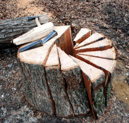 When players made splits, the grid became confusing. I was instructing players to make their split lines across all the tiles, regardless of whether they had been previously split into separate groups. This was confusing! With great feedback from another designer, Ryan Lambert, I changed this to only allow a split line to affect one group at a time. Again, the first time we played this way we never went back. Splitting complete!
Change Number 4: First Player Unfairness
If the first player is going to be an advantage, then each player should have an equal chance at this. Figuring out a mathematical equation comparing components and players was near impossible. So time to make a tweak. Again to the rescue comes a suggestion from Ryan Lambert about the first player responsibility being a tile in the grid. Once I tried this, I knew it was the fix I was looking for.
Change Number 5: A Somewhat Clunky Experience
Setting up the grid each round was clunky mainly because tiles one-sided and players had to check each side of each tile to see if there was a gem. But the relatively easy fix that worked out was to make tiles two-sided.
We also tried a variable shape setup to the grid. This was a fun experiment, but it became a point of analysis paralysis where players were trying to group things together intentionally. Too much power to the player setting things up solidified our decision on a standard grid.
Finally, we tried passing a box containing the sword tiles to the player setting up the grid each round. This was slightly clunky, but the other options we tried were worse. Preset stacks of tiles had a clunky long setup time. Stacks of tiles like Carcassonne performed okay, but the two-sided tiles solution was too good to pass up. It did give players a good amount of visible info when setting up, but making the distribution random helped with that.
Change Number 6: Revisiting Scoring
At this point Swordcrafters was running like a well-oiled machine, making it much easier to revisit scoring. Two scoring metrics that became very apparent during play testing were comparing swords for length, and building sets of gems – what we now call the sword quality.
The third metric was about keeping people interested if they were not in the quality or length game. But it proved a challenge to find something simple and intuitive. Enter Sword Magic. I called this a whole host of things in the past, but a Magic Sword is something people intuitively seemed to understand. During one play test at Protospiel Madison, the answer to this scoring riddle surfaced. I was playing with a designer named Francois, and after our game, I was inquiring about feedback. We got to the scoring section and I was simply not satisfied with the resolution. After swirling the topic of trying to find the right answer, Francois said a word that instantly made things click: MOST. It was amazing how one word immediately simplified the scoring. The player with the most gets 1st, second most gets 2nd, etc. There was no particular condition that needs to be met and lent to light end-game counting and no record keeping. It was elegant and effective! Lock it up.
Change Number 7: Gutting the Third Phase
Originally, the third phase of Swordcrafters was intended as a balancing mechanism so that the last player to select a grouping was the first player to do another thing. However, I also saw that this intentional balancing mechanism was confusing people. It wasn’t clear how things were interconnected mechanically or thematically. So we stripped out this third phase temporarily and streamlined things into just two phases, thinking that should help players understand interconnectivity better. It worked! The third phase never came back to the table after this.
And there we go! That’s how, with a lot of experimenting and a little luck, we arrived at the version of Swordcrafters that got published.
Swordcrafter’s publisher and co-designer Adam Rehberg was gracious enough to supply this design journal. He can be found most readily via Twitter.
Discuss this, and other articles, on our social media!
Photo Credits: All images by Adam’s Apple Games.

